
Donald Norman has often mentioned the importance of being a good observer to become a better product designer. In his book The Design of Everyday Things he says,
“Good design is actually a lot harder to notice than poor design, in part because good designs fit our needs so well that the design is invisible, serving us without drawing attention to itself. Bad design, on the other hand, screams out its inadequacies, making itself very noticeable.”– Don Norman
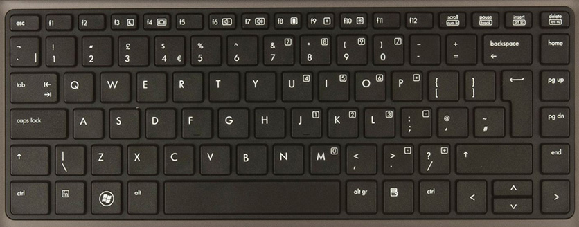
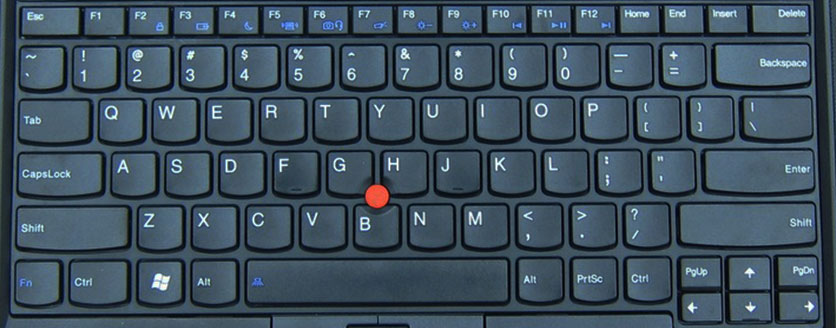
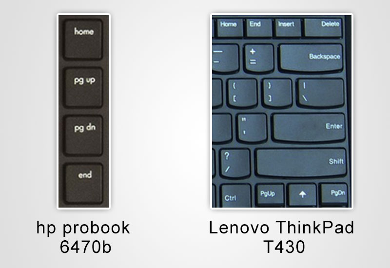
I recently realized this after receiving a different laptop at work when moving to another team. For three years, I had been using a “hp probook 6470b” and was now given a “Lenovo ThinkPad T430”. It is at this point that I realized how beautifully HP’s keyboard was designed. There seemed to be a lot of thought and research put into the placement, spacing and orientation of the keys and overall keyboard layout.
While the aspects I highlight might seem minor, they did have a big impact on how easily I could use the product. In this post I’ll share my observations (and learning) while comparing my experience with the two laptop keyboards.
Layout of arrow keys
HP has all arrow keys forming a confined box together, while Lenovo has the conventional layout with a “Page Up” and “Page Down” key on either side.
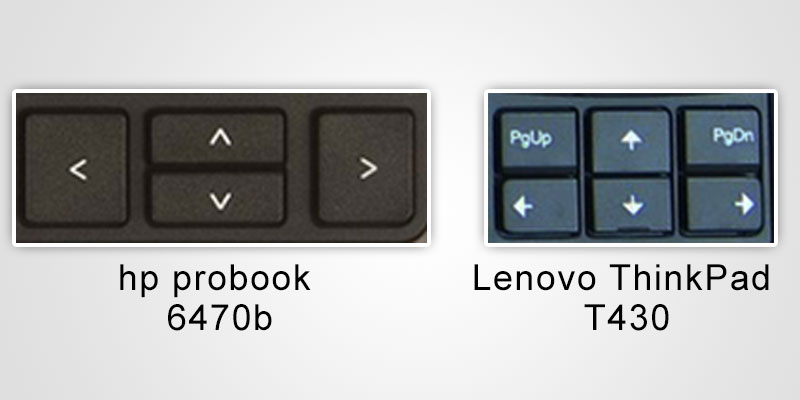
Outcome: I was more prone to making errors using the Lenovo keyboard, thanks to page up and page down (both extreme actions as compared to the arrow keys) being really close to the arrow keys. While editing a word document for example, the page would suddenly jump up or down making me lose track of my last location. On the HP keyboard however, I would at the most accidentally press another arrow key instead of the intended one which would in turn only result in the cursor either moving to the upper or lower line or character.
Learning: Ensure similar actions are grouped close to each other, while extreme actions are kept much further away. Another things to consider is frequency of usage of actions.
Context menu key
The HP keyboard has a context menu key next to the right CTRL key, while the Lenovo keyboard does not have any such key.
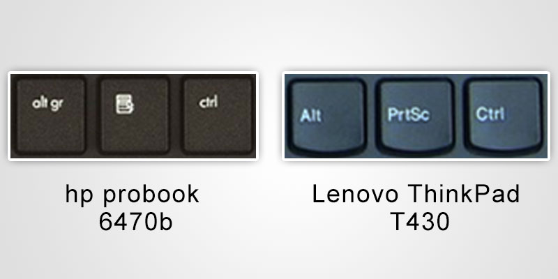
Outcome: It would allow me to quickly use “SHIFT” + arrow keys to select multiple files, text and what not and then quickly use the the contextual menu key to perform further actions on them. This was most handy when editing text, I could quickly select misspelled words by moving the cursor to somewhere in between of the word, press the context menu key and then select one of the suggestions all without taking my hands off the keyboard. While using the Lenovo laptop, there was no context menu key, which meant I had to use the keyboard to select the word or navigate and then shift entirely from using the keyboard to using the mouse only for one action – Right click. This gets annoying.
Learning: Try and put all steps of a action path together or at least on the same medium.
Arrangement of “Home”, “Page Up”, “Page Down” and “End”
The HP has these four keys exactly mapped to their functions (Home right on top, followed up page up, page down and finally end at the bottom. Lenovo on the other hand has “Page Up” and “Page Down” with the arrow keys and “Home and “End” at the top of the keyboard.
Outcome: This makes the use of these keys very intuitive, I did not have to learn the position of the keys as they were all linked to a simple logic that I was already aware about. On the Lenovo keyboard the “Home” and “End” are right next to each other, while “Page Up” and “Page Down” are next to the arrow keys. This forces the user to scan the keyboard in search of these keys.
Learnings: Map object placement to their logical action or nature. There should be a correlation between where an element is placed, what it does, it’s nature and it’s relation or other elements placed around it.
I’m not saying HP is great or Lenovo is bad. They both probably can beat each other with in various other areas. I’m also not saying that HP is the best keyboard out there. There are probably many more keyboards better then the HP or worse than Lenovo, all I’m trying to highlight here, is that good design lessons can be found all over. It’s great to be observant, especially with our daily tasks to understand what it is exactly that makes bad design bad, and more importantly, what makes great designs great.
Have you noticed great UX examples in our day to day objects? Feel free to share them in the comments below.
P.S : The views expressed here and solely my personal opinion and observations. I neither endorse nor oppose any of the products compared here.